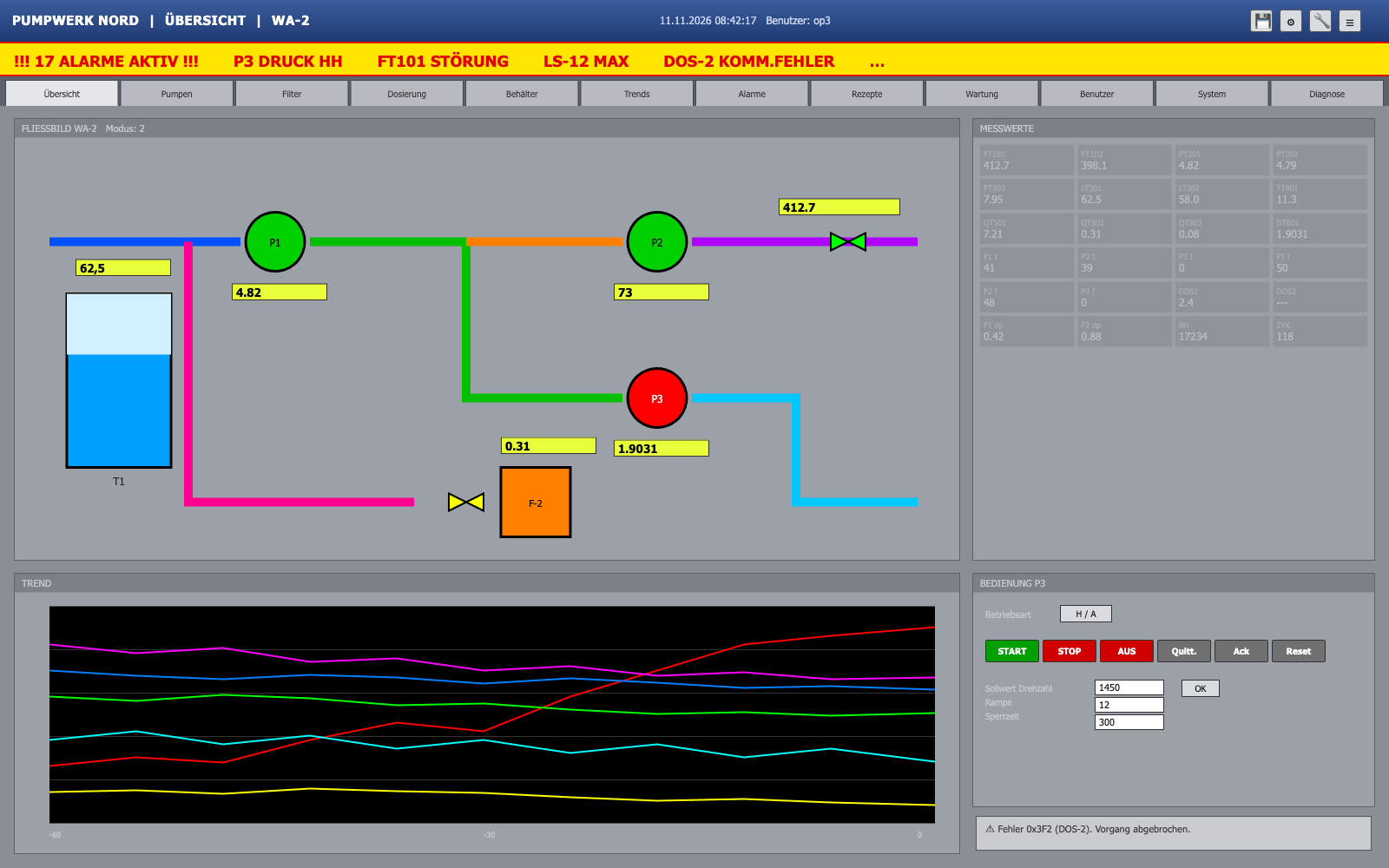
Water treatment control room, 24" monitor, distance 60 cm to 2 m, shift operation
Method
Heuristic review by a UX designer with industrial experience
Date
11 Nov 2026
The essentials in three sentences
1.In normal operation the display is readable. In an upset it is not: 17 alarms of equal rank, pump state shown only in red and green, and STOP, OFF and Acknowledge 4 px apart.
2.Most findings can be fixed without touching the control logic, with colour, text, grouping and spacing.
3.Start with alarm prioritisation (1), making state readable without colour (3) and spreading out the P3 controls (9).
Severity levels
CriticalCan cause a wrong action or a missed alarm in an upset. Fix now.
HighCosts time or causes errors every day. Next release.
MediumSlows down and confuses, workaround exists. Plan it.
LowCosmetic or onboarding. When the area is touched anyway.
Score by area
Overall
40 / 100
Nielsen's 10 heuristics
42
9 of 10 heuristics with at least one finding
Accessibility (WCAG 2.2 AA)
31
Contrast 1.35:1 to 1.6:1 on values, state shown by colour only
UX laws
48
Fitts, Hick, Miller, Jakob, Gestalt
ISO 9241-110 dialogue principles
45
Weak on self-descriptiveness and error tolerance
Industrial (ISA-101, gloves, distance)
34
Full colour in normal operation, small targets, values unreadable from 2 m
0 to 100 points. From 80 an area is good; below 50 it costs time every day and raises the risk of operating errors.
Findings mapAnnotated screenshot
Numbers match the findings below.
Click a marker or pick a finding in the list. Arrow keys switch, Esc closes.
1
CriticalAlarms
Alarm banner without priority
Observation
17 alarms scroll by in red on yellow, all of equal rank. The first-out alarm (P3 pressure HH) and consequential alarms look the same. The banner flashes constantly, also for alarms already seen.
Reference
Nielsen #1 Visibility of system status · ISA-18.2 / EEMUA 191 (prioritisation, alarm floods) · ISA-101 (alarm display) · WCAG 2.2.2 (stop blinking)
Fix
Three priorities coded by colour, shape and number at once. Banner shows only the highest open alarm and the count per priority. Group or suppress consequential alarms. Flash only unacknowledged alarms.
17 alarms scroll by in red on yellow, all of equal rank. The first-out alarm (P3 pressure HH) and consequential alarms look the same. The banner flashes constantly, also for alarms already seen.
Reference
Nielsen #1 Visibility of system status · ISA-18.2 / EEMUA 191 (prioritisation, alarm floods) · ISA-101 (alarm display) · WCAG 2.2.2 (stop blinking)
Fix
Three priorities coded by colour, shape and number at once. Banner shows only the highest open alarm and the count per priority. Group or suppress consequential alarms. Flash only unacknowledged alarms.
2
MediumNavigation
12 tabs of equal weight
Observation
Overview, diagnostics and user management sit side by side at the same size, 10 px text. Operators search every time.
Reference
Hick's law · Nielsen #8 Aesthetic and minimalist design · ISA-101 (display hierarchy levels 1 to 4)
Fix
Five to six areas based on shift tasks, the rest under "More". Hierarchy overview, unit, detail. Tabs with 16 px text and at least 44 px height.
3
CriticalStates
Pump state only in red and green
Observation
Whether P1 to P3 are running, stopped or faulted is shown only by fill colour. With red-green colour deficiency (about 8% of men) P2 and P3 are hard to tell apart. Red means both "stopped" and "fault".
Reference
WCAG 2.2 1.4.1 Use of colour · Nielsen #1 · ISA-101 (reserve colour for abnormal states)
Fix
State as text below the symbol ("running", "stopped", "fault") plus shape or outline. Normal operation in grey, red only for alarms.
4
HighColour
Full colour in normal operation
Observation
Six pipes in six saturated colours, yellow value fields, orange filter. When everything is colourful, the one deviation no longer stands out.
Reference
ISA-101 (muted base colours, colour with meaning) · Gestalt: similarity · Nielsen #8
Fix
Grey background, pipes in neutral grey, medium shown by label or line style. Fix the colour palette and meanings in an HMI style guide.
5
HighValues
Values without units, mixed formats
Observation
"1.9031", "73", "62,5": no unit, point and comma mixed, zero to four decimals. Only someone who knows the plant knows what "73" is.
Reference
Nielsen #2 Match with the real world · Nielsen #4 Consistency · ISO 9241-110 Self-descriptiveness
Fix
Every value with unit and plain-language label. Decimals set by measurement resolution. One decimal separator throughout.
6
HighLegibility
Value grid barely readable
Observation
Grey text on grey with contrast of 1.35:1 (label) and 1.6:1 (value), text size 9 to 12 px.
Group by function (inlet, pumps, treatment, outlet). Four to five key figures large at the top, the rest in the detail display. Tag number small below the plain name.
8
MediumTrends
Trend without legend or units
Observation
Six coloured lines on black, no legend, no unit on the axis, time axis "-60 / -30 / 0" without unit.
Reference
Nielsen #6 Recognition rather than recall · ISO 9241-110 Self-descriptiveness · ISA-101 (trends with limits)
Fix
At most three lines per trend, legend with unit, limit line, time axis "-60 min". Distinguish lines by dash style as well.
9
CriticalControls
STOP, OFF and Acknowledge packed together
Observation
Six buttons of the same size (62 x 26 px) with 4 px gaps. OFF looks like STOP, sits next to "Quitt." and runs without confirmation. With gloves it is easy to hit the neighbour.
Reference
Fitts's law · Nielsen #5 Error prevention · ISO 9241-110 Error tolerance · Glove operation (practical guide value 15 to 20 mm target size)
Fix
Separate frequent and critical actions. Targets at least 15 mm, better 20 mm, gap at least 5 mm. Consequential commands with confirmation and preconditions. Emergency stop stays hardware (EN ISO 13850); no soft key may look like one.
10
HighStates
Operating mode unclear
Observation
"H / A" does not show which mode is active. The process display says "Modus: 2". Mode changes without a clear indication are a common cause of operating errors.
Reference
Nielsen #1 · Nielsen #2 · ISO 9241-110 Conformity with user expectations and self-descriptiveness
Fix
"Mode: AUTOMATIC" as text, fixed in the header. Switch through a dedicated dialog that names the consequences.
11
LowNavigation
Icon-only toolbar
Observation
Floppy disk, gear, wrench and menu without labels. Gear and wrench cannot be told apart.
Reference
Nielsen #6 Recognition rather than recall · Jakob's law
Fix
Icon with text ("Save", "Settings", "Maintenance") or text only.
12
MediumMessages
Error message as a code
Observation
"Fehler 0x3F2 (DOS-2). Vorgang abgebrochen." says neither what happened nor what to do.
Reference
Nielsen #9 Help users recognise, diagnose and recover from errors · ISO 9241-110 Error tolerance
Fix
Plain language: what happened, what it means for the process, what to do. Code only as extra detail for maintenance.
13
HighInputs
Setpoints without unit or limits
Observation
Speed 1450, ramp 12, lockout 300: no unit, no allowed range. One "OK" applies to all three fields, with no before and after.
Reference
Nielsen #5 Error prevention · ISO 9241-110 Self-descriptiveness and error tolerance
Fix
Unit and range at the field (e.g. "rpm, 0 to 1500"). Confirm changes showing old and new value. Reject values out of range.
14
HighDistance
Key values unreadable from 2 m
Observation
Outlet flow, network pressure and tank level have the same size as every minor value (13 px, about 3.5 mm on the 24" monitor). From 2 m, text needs about 12 mm character height.
Reference
ISO 9241-303 (character height approx. 20 arc minutes) · ISA-101 (level 1 overview) · Gestalt: figure and ground
Fix
Four key figures large (40 px and up) with unit in a fixed area. Tone everything else down.
15
LowLanguage
Inconsistent terms
Observation
"Quitt." and "Ack" sit side by side, "Reset" is unclear. The banner says "KOMM.FEHLER", the message says "Fehler".
Reference
Nielsen #4 Consistency and standards · Jakob's law
Fix
One term per action ("Acknowledge"), glossary in the HMI style guide, abbreviations only where the shift uses them.
What it could look like
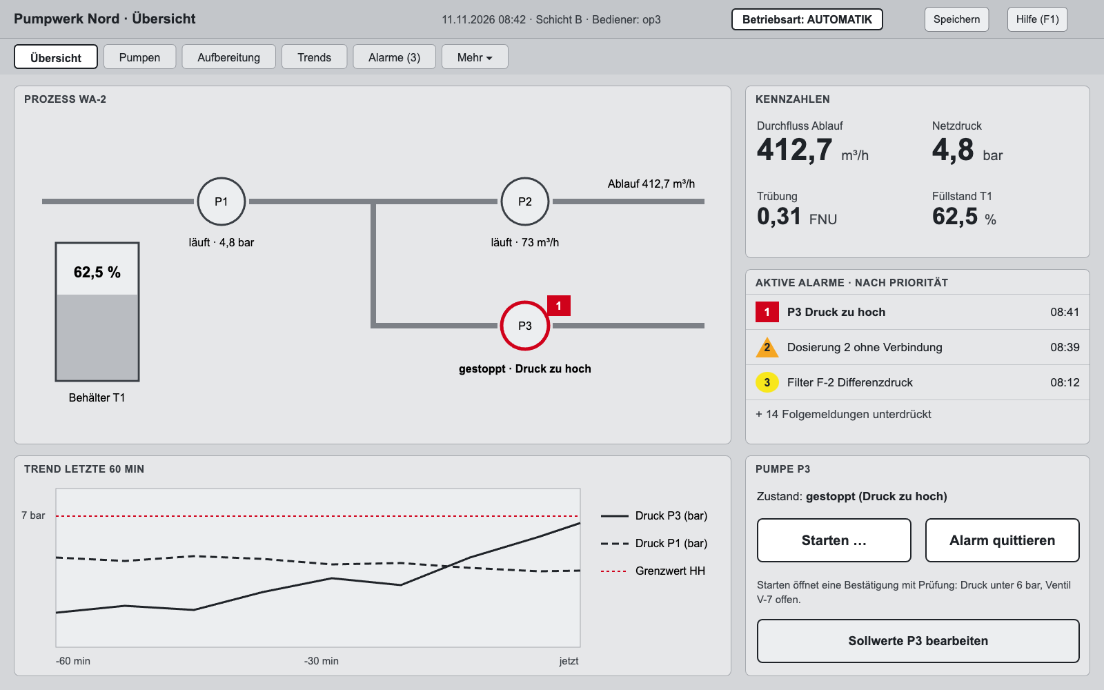
Sketch of the same fictional plant with the main fixes: grey as base, colour only for deviations, alarms by priority, key figures large with units, large separated controls. A sketch does not replace a test with operators.
Recommended order
Now
Prioritise the alarm banner and bundle consequential alarms (1)
State as text at every unit (3, 10)
Separate OFF from Acknowledge, add confirmation (9)
Next release
Greyscale base display and colour rules in the style guide (4)
Units, formats, contrast (5, 6, 13)
Key figure area readable from a distance (14)
After that
Task-based navigation (2)
Trends, message texts, terms (8, 12, 15)
Usability test with 5 to 8 operators in an upset scenario
How we review
A UX designer with industrial experience reviews the screen against five frameworks: Nielsen's 10 heuristics, WCAG 2.2 AA (contrast, target size, text size, colour-only signals), UX laws (Fitts, Hick, Miller, Jakob, Gestalt), ISO 9241-110 dialogue principles and industrial specifics (ISA-101, glove operation, reading from a distance).
Every finding gets a severity, its location in the screenshot, a reference and a concrete fix. We measure contrast and convert sizes using your monitor and viewing distance.
Limits: a heuristic review of one screen does not replace a test with your operators and does not see flows across several displays. We use the standards as a reference for good practice, not as certification.